Thursday, 13 April 2017

Quick Update of the Last Year

So for the last year I've been working in my final year of Uni and working on many different topics from society to social media to myself but the medium in which I use hasn't really changed since I last posted, I work mostly digitally, specifically Digital Illustration. So here's a quick rapid fire of the work I've done in the last year.

Firstly I worked around the idea of the negative impacts that Social Media has on people, specifically the younger generation, even looking into Facebook Disorder which is a real thing. I tried showing how social media helps people create masks for themselves and hide what they truly feel and think, can even change the way people perceive them in the real world. I did a serious of 20 of these portrait Illustrations trying to emphasise this problem.


For my next piece I solely focused on something I'd been interested in for awhile, '.gif' using a perpetually moving image. However for this project I needed to make a sculptor so I decided to combine the ideas and create a living .gif with a little research, some paper and basic rudimentary shapes I was able to present this next piece in an Exhibition at Karst in Plymouth.


After this I decided to make an actual .gif and present it in a show at Ocean Studios called 'Dualities' with this I decided to focus on more of the digital side of things and the amount of effort it takes to have an online presence, tying back to my previous workaround social media. I represented this by using a QR code that you would need o scan to access the image called '.Gift'.


Revamp!!!!....hopefully

It's been quite a few years seen using this blog but now being in the last few months of Uni I've decided to Revamp!! I've redesigned the blog and now I plan to make regular posts about current projects, events, exhibitions going on and updates on Art pieces I've been working on. This blog is more for me, to hopefully give myself a reason to regular update my work and keep it all in a working order, but if anyone does so happen to come across this blog then by all means read and explore all you like :)

Thursday, 15 May 2014

'Star' Photo Shoot

As Primary research I decided on taking photos of the night sky and any visible stars.

These photos also remind me of light polution so I wonder if it would be a good idea to but some focus into that or if it would be to much of a diversion to my project.

This also shows me a range of colours I can incorperate into my experiments.


I wasn't able to get super, great, clean photos of the stars however it still looks looming and has that effect of 'small' making us feel tiny in comparison to every thing else plus it shows me that using large amount of black can have a good effect, It can also be more visually apealling than you would realise.


Seb Jarnot

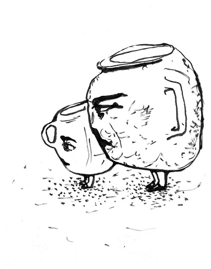
Another Illustrator that I believe would work with the star theme is Seb Jarnot. He has a very free style using mostly line and dot based art work to a comical effect.

This could work with constellation drawings where I could join the stars plus the comic aspect is something I've already worked with, with my illustrations. I also like the idea of implementing one colour but maybe trying to move away from 'Poster Art' style.


Thursday, 8 May 2014

Isabel Bostwick

Isabel Is an Illustrator that uses very line based fantasy drawings that look almost primitive.

I believe her work could work well with my star themed work, the idea of of keeping simple outlined base work focused around fairy tails and myths along with animal and people could work very well when trying to illustrate the zodiacs and other constellations.

Using few pale colours as well has a nice feel to it, it's as if she is taking real life  scenes and putting them into these story book scenarios.


Theory Illustrations

I wanted to take this project with a Illustration aproach so I decided to create Illustration interpretation on theories on what people use to believe stars were from greek and indian mythology.


From ancient Indian believes there was a common theory of stars being giant crystals/diamonds in the sky, this is where the nursery rhyme originates from.
 
I like the comecial concept of this illustrastion and using a combination of heavens mythology and what stars are to create an element of fantasy in this and then surported with the stick characters with no facial features.


This theory is from Greek mythology and the belief was that the night sky was a giant greek bowl hoovering over the world filled with holes that the gods had poked in to watch down on man.
 
I also like the ridiculousness of this illustration using a common china plate you would find in any household and once again using combination of heaven being above the plate and the earth being flat to once again reinforce the fantasy element. 


Thursday, 1 May 2014

Roger Hiorns 'Crystal Room'

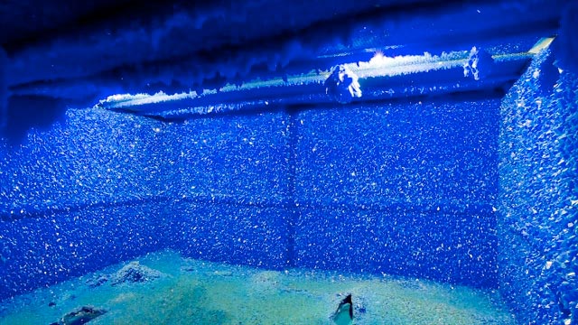
Roger Hiorns created this very experimental piece that surprised everyone, he went to a building schedulded to be demolished and took a very run down apartment and sprayed the thing with copper sulphate in hopes it would create a crystal wonder land.


After four weeks of drying out the place he was left with a beatiful crystal palace, this blue building reminded of me the night sky and the greek theory of stars being crystals and diamonds in the sky, I think I will try my own crystal experiments using salt crystals to create a shine on paper and maybe even add colour and trying to draw with this solution.


Final Major PROJECT 'Stars'

My next project is my 'Final Major Project' this will be my last art project for this course and I have chosen 'Stars' to be the subject of this last leg of this course.

I've always wanted to do an Art Project around 'Stars' the big spacey kind not the X factor kind. I've decided to start this project off by looking at some other famous art works around stars like Van Gogh's 'Starry Night' and then do some research on astromony, constellation and even astronaught quotes and facts.


This work reminds me of some other work done by Roger Hiorns and his crystal room, I may do some further research for inspiration for my art.

Thursday, 6 March 2014

File Types

There many programs and files I will use on a daily basis with PSD/JPG/Tiff/PNG/Gif. I'm going to attempt to explain the difference between these file types and what a file extension is.

JPEG- a JPG is a simple and most used image file which will be used for social networking, web design, and graphics.

Gif- a Gif file is another image file but uses certain amount a frames to create a short animated image, also used for social networking and web design.

PSD- Is one of the first all round file that be used for Images,Video,Text ect. Made as an early translator for other new programs being released.

PNG- 'Portable Network Graphic' file was made to be a replacement for a Gif file since it does same stuff with the exception of being able to be edited and compresed for the Internet.

Tiff- 'Tagged Image File Format' is another image file but far more complicated, for use of proffesional graphic designers and proffesional Photographers with some amateurs as well.


Finally a 'File Extention' or 'Filename Extention' is way to change a file from being 'example' a PNG to a JPEG, by adding '.png' or '.jpeg' at the end of the file. This won't change the data of the file but allow you to access it in another program, however you can't change a text file into a image file and expect a Program that deals with images to be able to open the file.

Thursday, 13 February 2014

'www.thisiscollosal.com' Bredan Monroe

My attention have been brought to a art like website called thisiscollosal where anything adnormal, comical, illustrative and pretty much anything art related is shown to the world, there are many different artist and creators on this website and so I've just chosen one to show.

Bredan Monroe looks at 'Topography' Map making but in art usaully using a combination of natural and artifical forms involving location in some way.

"Oakland-based artist Brendan Monroe has been on a tear lately a solo show and several group exhibitions featuring his delightfully strange human and topographic forms composed of whirling rivers and swarms of color. The artist says his artwork is mostly rooted in science and then executed through painting and sculpting, which is not hard to see given the flow of energy found in each piece that seems influenced by the flow of water, tornadoes, or the grouping of microorganisms"
http://www.thisiscolossal.com/2013/09/brendan-monroe/


This work is inspiring for my own ideas on how to invovle map design and drawing together and I defintely recommend looking at this website for Inspiration, research or for fun.


Maps

I've been looking at maps of Exeter to start of my project and lead me into my photo shoot of my Everyday Journey in and out of Exeter city. I oviously started with google maps finding my routes around the area, where lived and plain birds eye view images and actual maps.


Continuing from this I decided to practice with my digital skills on photoshop and have a mess about with these maps with colours, contrast and consistinsy. 


These images have certain visual effect that work well with there concept like the first image looking like city lights shaped like lightning hitting the ground and the second giving of a urban feel like complicated graffiti on the wall. These picture are nice to look at but I'd would rather involve some drawing skills ino it weither it by observational or imaginary.

Thursday, 6 February 2014

The City

After finishing 'Traces 2' I've moved onto my next brief with a choice of 'Boundaries', 'City', 'Book Makeover' and 'Domestic'. As you can tell by the title I've chosen 'City' as my starting point and I have started looking into Map Art and everyday journeys.

As first Inspiration for this project I've looked at Glynis Tinglof who paints abstract pieces based around maps and cities using warmer colours found on maps of fields or of the place in which the painting is of.


From here I'll try experimenting with observational drawing and implementing it into other abstact map work, I'll also take a photo shoot of my way into college and my everyday journeys around exeter city.

Thursday, 23 January 2014

PDF

As a look into Digital Art I decided to look into programing itself starting with the PDF file.

'Portable Document Format' was originally created as a way to link all file formats from word proccesors to a variety of image and graphic formats. This was due to the early days of the internet and everyone having different programs and files, so weren't able to open documents that would have been sent to one another.

Today Adobe is more of a tool program to help edit certain images, videos/animations and word based documents and this seems to be the direction in which it's taking with portfolio tools and buisness tools becoming a real proffesional and common program.

Thursday, 5 December 2013

Finalizing Ideas - Montage

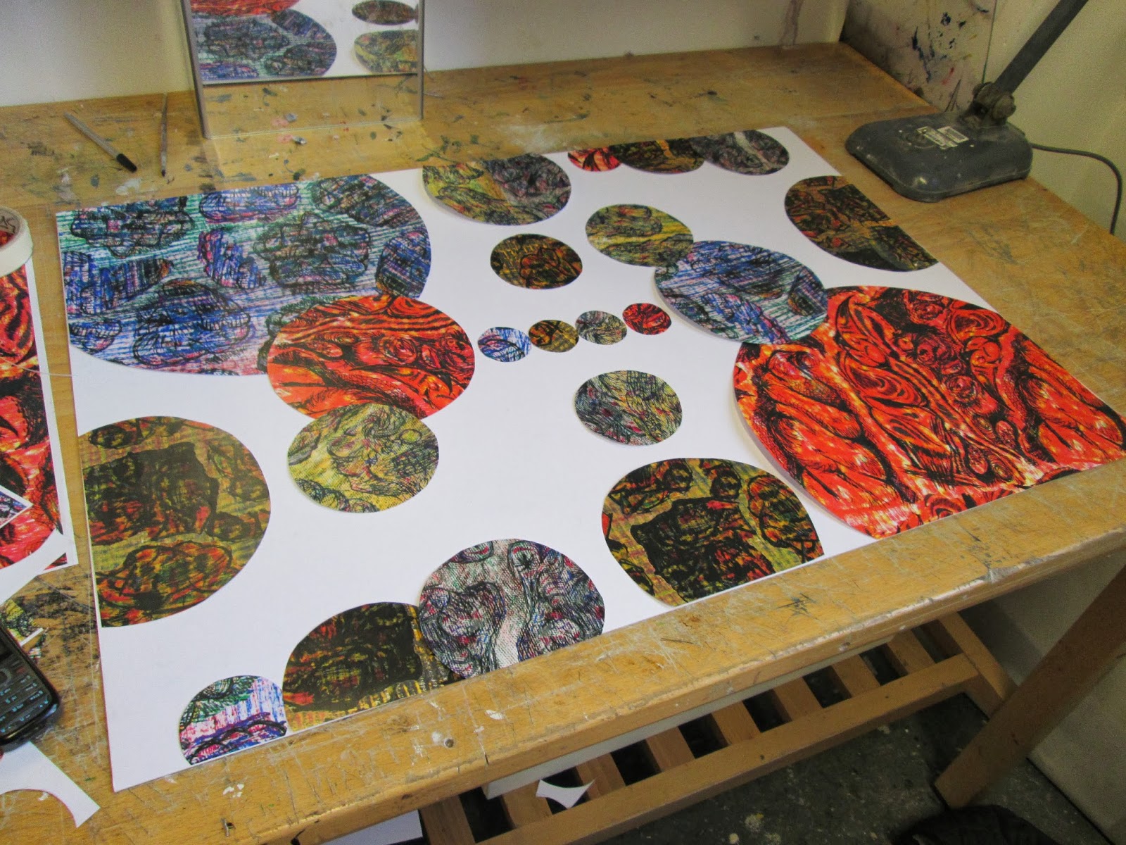
One of my final ideas was to take my texture pieces and cut them up and then take inspiration from Mondrian and work into composition with collaging these cut up pieces into a Montage.


This was alright and had visually apealing quality but wasn't as Bold as I would have liked it to be and didn't involve half of the things I had looed into so was kind of pointless.

So I decided just to stick everything together, by taking my texture, drawing experiment pieces and montaging them I would involve what I had learnt from Mondrian, it would involve the drawing techniques learnt from Claude Heath and blind drawings of rocks and traces would involve my Journey ideas and Ester Roi's concept.
Finally to link it all together I decided instead of using various squares and rectangles I would use circles to incorporate my digital pebbles work and 3D experiments.


I believe this idea came out extremely well and even though it may need a tweek here or there for now it brings all my ideas together and shows what 'TRACES' means to me.


Combination Experimentation

In a attempt to fuel some ideas I tried experimenting with my last two pieces, 'Claude Heath Drawing Technique' and 'Texture works' and entwining them together to create these stand out pieces.


These were created by taking these texture rubbings which I explained in my last post how they were made, and taking a subject to blind draw from 'in my case a rock or sculpture' and then using pens, pencils and fine liners to draw over the top.
Also to give it even more stand out quality I then took it to photoshop where I filled the page and upped the exposer and contrast. 

Thursday, 21 November 2013

Claude Heath

Claude Heath is an Artist renowed for his blind studies where he uses one hand to feel the subject and draw with the other hand all while blind folded.
"You create a problem and become fascinated with 'it'. (1) This line is one which feeds centrally into the artist's own work.
Heath's drawings are intense, private dialogues between the sitter/object and the artist. Larger installations and prints require a modification of technique. The artist photographs his work, then projects the enlarged images onto paper, tracing the lines one by one with a pounce wheel, which perforates the surface. He then fixes the colour through the 'stencil'. These images lose the nervy intensity of the drawings, but produce a more clearly articulated line."


The idea that you create a promblem just so you can solve it is what drives Claude to create these amazing pieces using pens, pencils and fine liners.


I still want to incorporate the idea of rocks and traces with in them and I would like to show this with drawing techniques like this and it would also give more of a focal point. I will practise these techniques for now until I can find a way to mix it in with my abstract coloure and texture ideas.


Piet Mondrian

Piet Mondrian is worked with his art through the War which ended 1918 where he then moved back to France Mondrian began producing grid-based paintings in the late 1919, and in 1920, the style for which he came to be renowned began to show.

"All painting – the painting of the past as well as of the present – shows us that its essential plastic means we are only line and color." Mondrian believed all things were simply line and colour and wanted to show this in his work which in the later years became a little more abstract yet with a more focal point to it.


I believe this style will work well with what I am trying to accomplish, no to have lines and primary colours but texture and composistion and there is no one better for shape and composition than Modrian which is why I want to incorporate his style into my work.

Texture

After looking at individual parts of my work what I realised was as indvidual textures my work looked very Abstract and Sureal which produced great quality work.


These pieces came of visually apealing, they were made by using tracing paper and materials like cardboard and wire to create these colourful rubbings with oil pastels, pencils and charcoal.

I plan to take it a step further and cut them up and place them together to create an abstract composition like Mondrians work except with texture rather than primary colours.


example -